
Sales chart is an app for store owners to see their recent orders metrics visualized by intuitive charts. Store owners can easily understand how many products from different categories were ordered in a daily basis in last 7 days. Also, it shows a sorted visualization of the best selling product types withing the last 7 days overall. And lastly, store owners can get an idea of the countries to which countries the orders are being shipped to.
There are 3 charts shown in the app's index page-
-
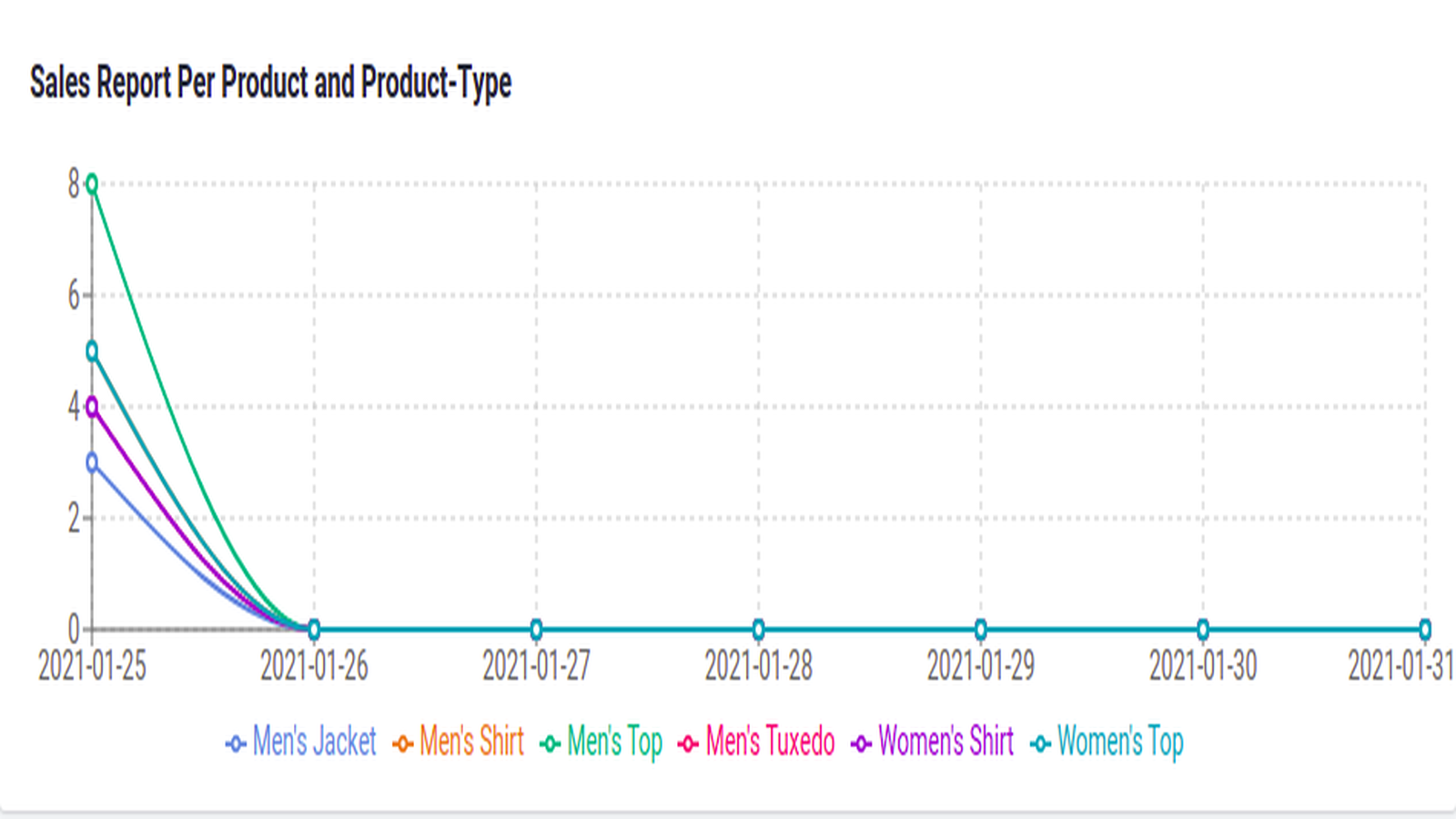
A Line Chart – This line chart shows the last 7 days in the X-axis and the number of products (marked with product type) ordered in those days in the Y-axis. (Take a look at sample screenshot 1 in the media gallery for sample visualization).
-
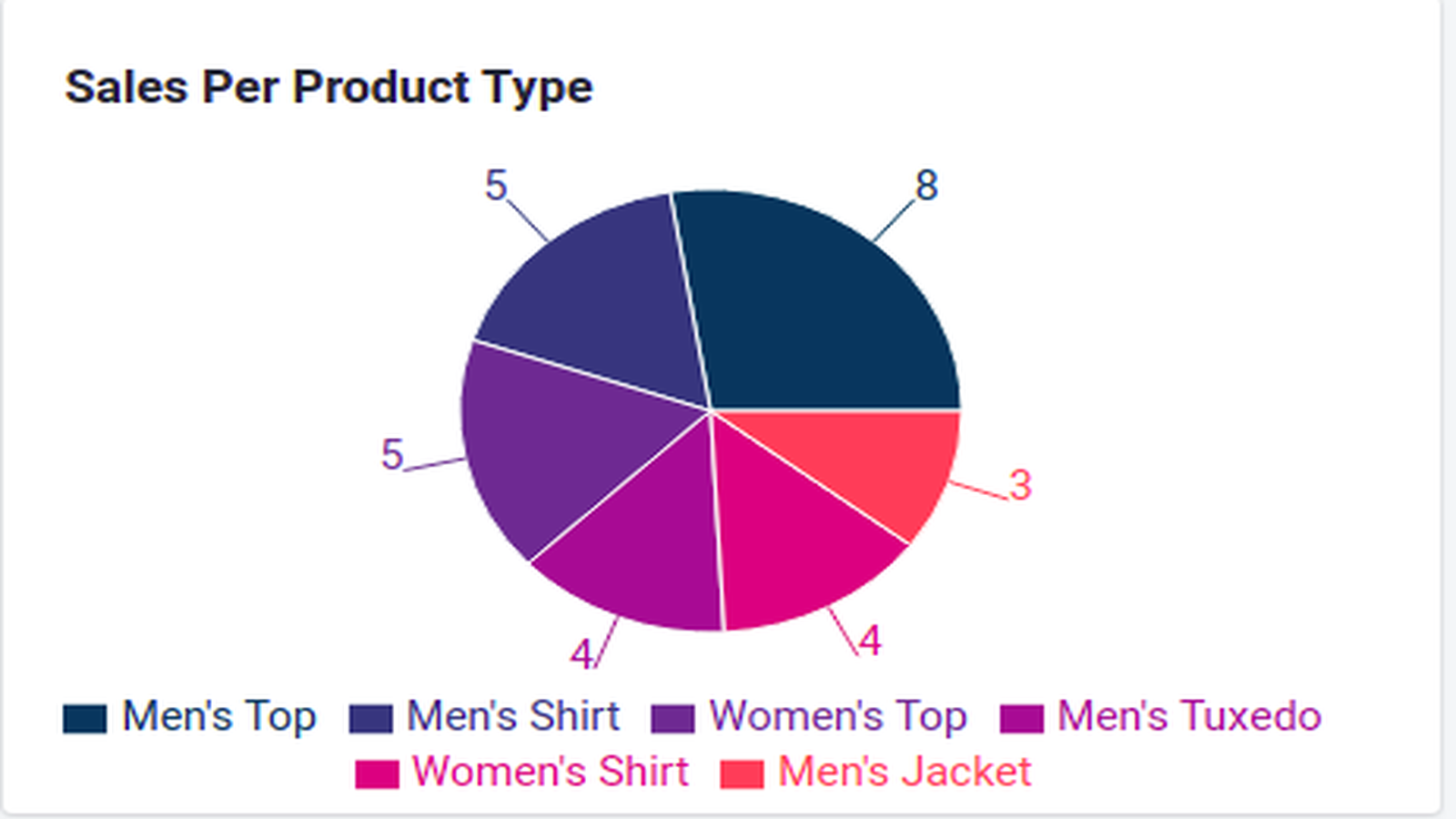
A Pie Chart – This Pie chart shows how many products from each product-types were ordered in total. (Take a look at sample screenshot 2 in the media gallery for sample visualization)
-
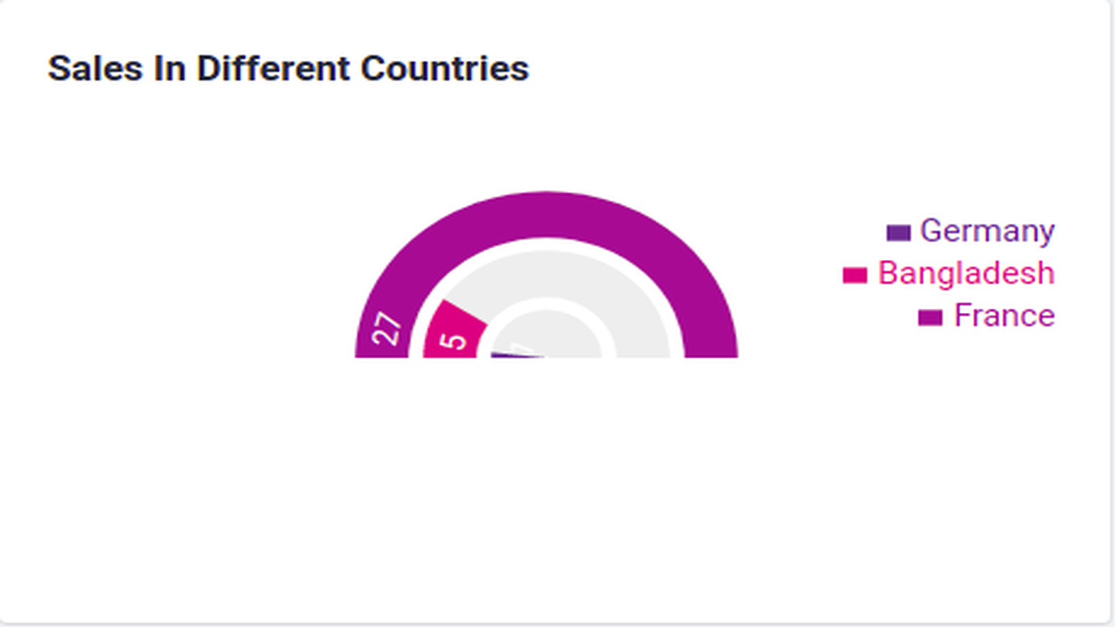
A Radial Bar Chart – This Radial Bar chart shows the Top countries to which the orders are being shipped to. (Take a look at sample screenshot 3 in the media gallery for sample visualization)
Key Benefits –
- Get your recent orders' data all in one view
- Spot trends easily with graphically displayed data
- Get to know which product-types should be stored more in the inventory.
- Get to know which single product is most popular and should be more available.
- Get a gist of the countries from which the customers are relying/liking your products and get to decide in which countries the marketing should be taken more seriously.
- Get to know the least popular items in your product list and get to rethink about their quality and appeal to the customers and consider if they should be in discontinued or not.
